Combining colors that look harmonious and smooth can be difficult for many people. However, you do not worry too much about this problem, because now there is a color wheel to support us. So how to use it correctly to have many stylish outfits? Let's explore with Shondo the article shared below.
1. What is the color wheel?
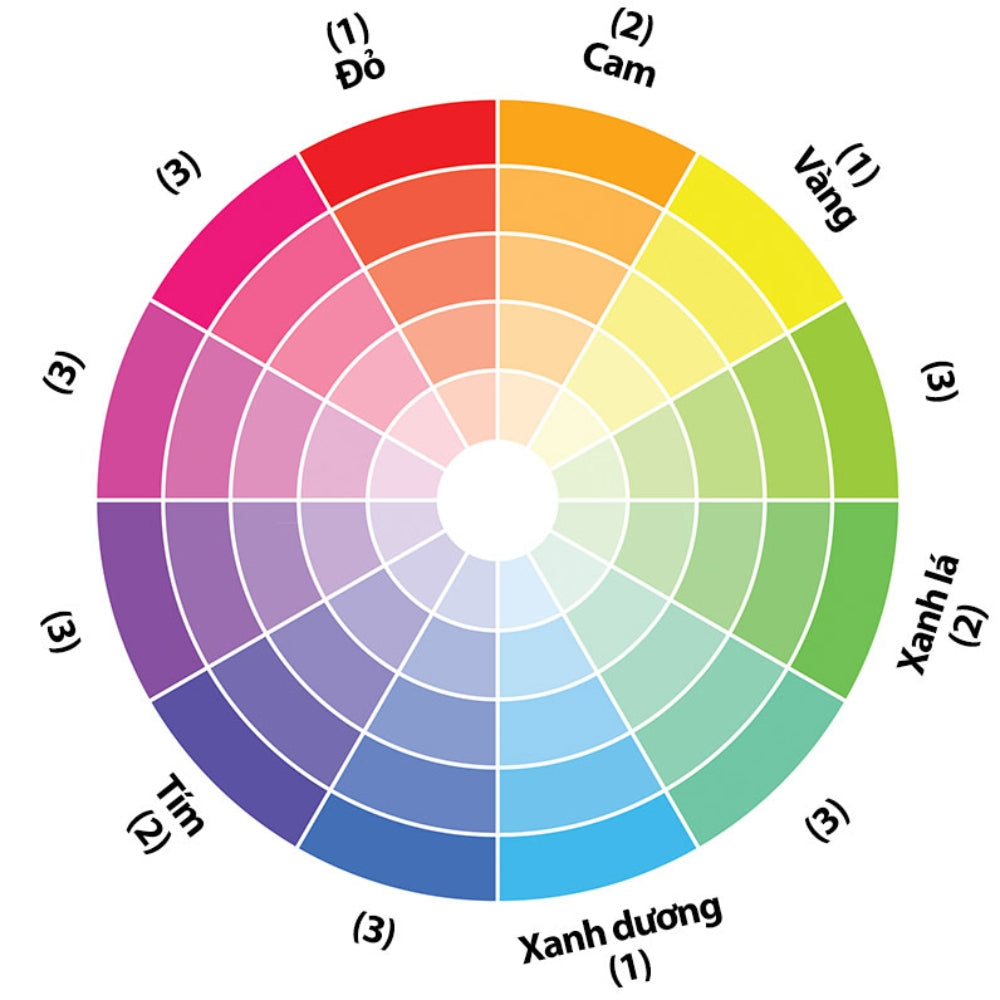
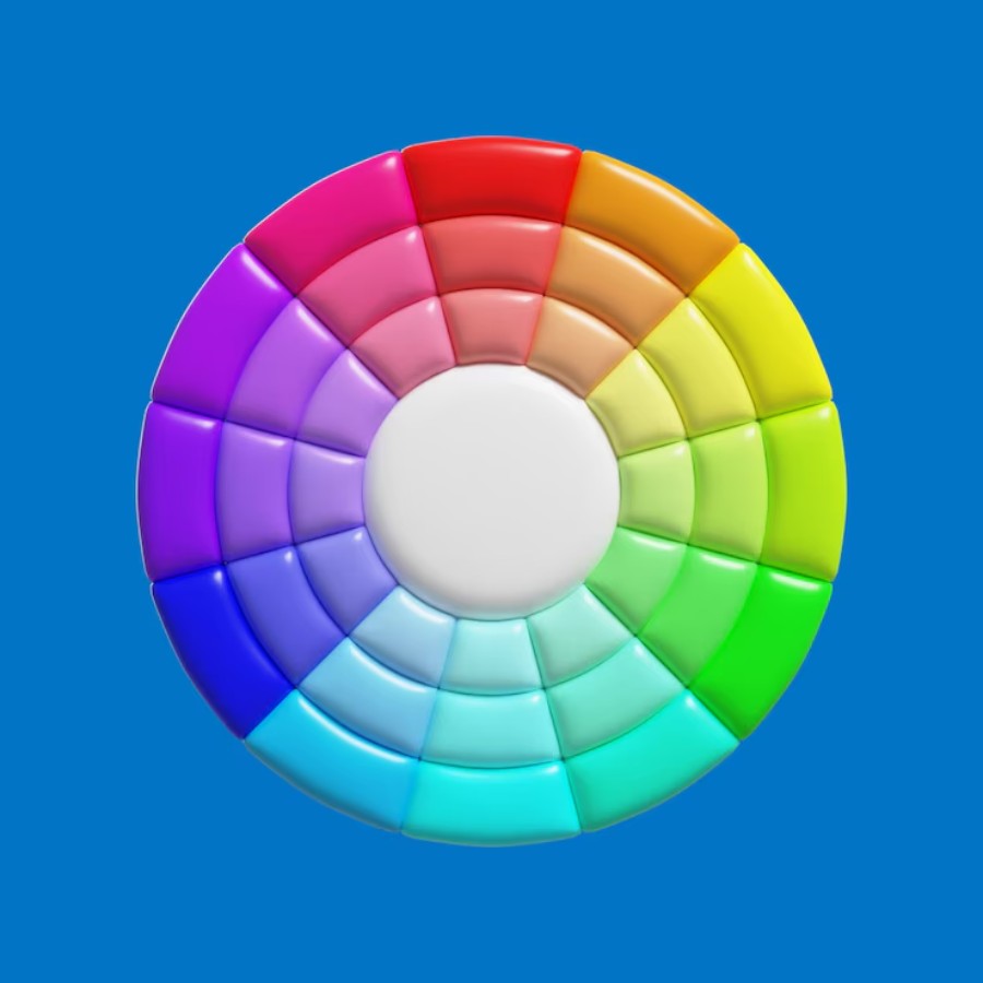
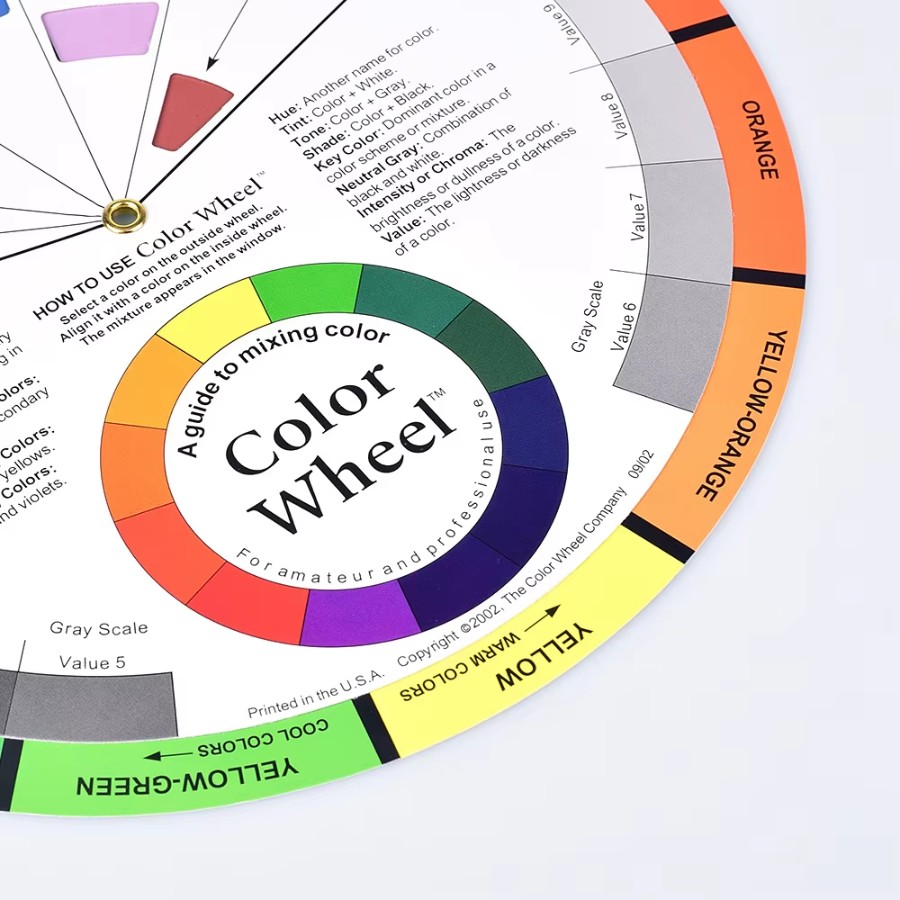
The color wheel is a circular diagram divided into different sections, each representing a specific color. This tool is widely used in art, fashion, and many other fields to help users understand how to combine colors.
Each color has its own characteristics and when combined, they create different effects. The main purpose of this wheel is to provide viewers with a visual representation of the relationships between colors, thereby helping them choose the colors that best suit their specific needs.
2. History of the color wheel
The idea of classifying colors began with scientists and artists like Isaac Newton in the 17th century. He conducted experiments with light and showed that white light could be broken down into different colors through a prism.
In the years that followed, artists and designers continued to refine the color wheel. A notable contribution was made by Johann Wolfgang von Goethe, a German poet and philosopher who theorized about colors and their effects on humans.
Today, this wheel has become an indispensable tool in many fields. It helps users create colorful and emotional works, while also increasing the ability to be sophisticated in their choices.

3. How many parts does the color wheel consist of?
The basic parts of the color wheel include primary colors, secondary colors, and tertiary colors. Each of these color levels has its own role in creating richness and variety.
3.1 Primary Color
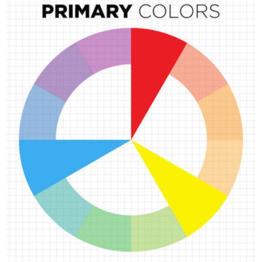
These are the primary colors. Typically, the primary colors include red, yellow, and blue. These three colors are the foundation from which all other colors can be derived.
The interesting thing about primary colors is their strength and distinct personalities. Red often represents love and passion, yellow represents happiness and energy, while blue conveys a sense of peace and trust.
3.2 Secondary Color
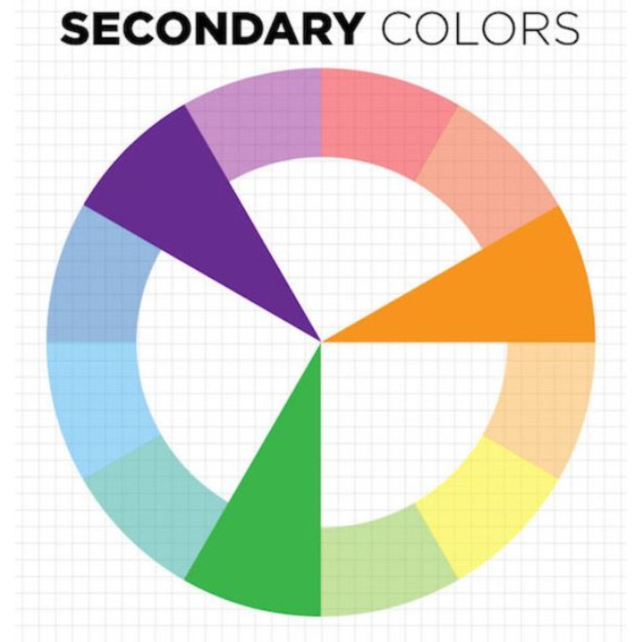
Secondary colors include orange, green, and purple and are created by mixing two primary colors together. For example, when you combine red and yellow, you get orange. Mixing yellow and blue gives green, and so on.
They are often used to create movement and energy in artwork or design. These colors are popular in advertising and media because they easily attract the attention of viewers.
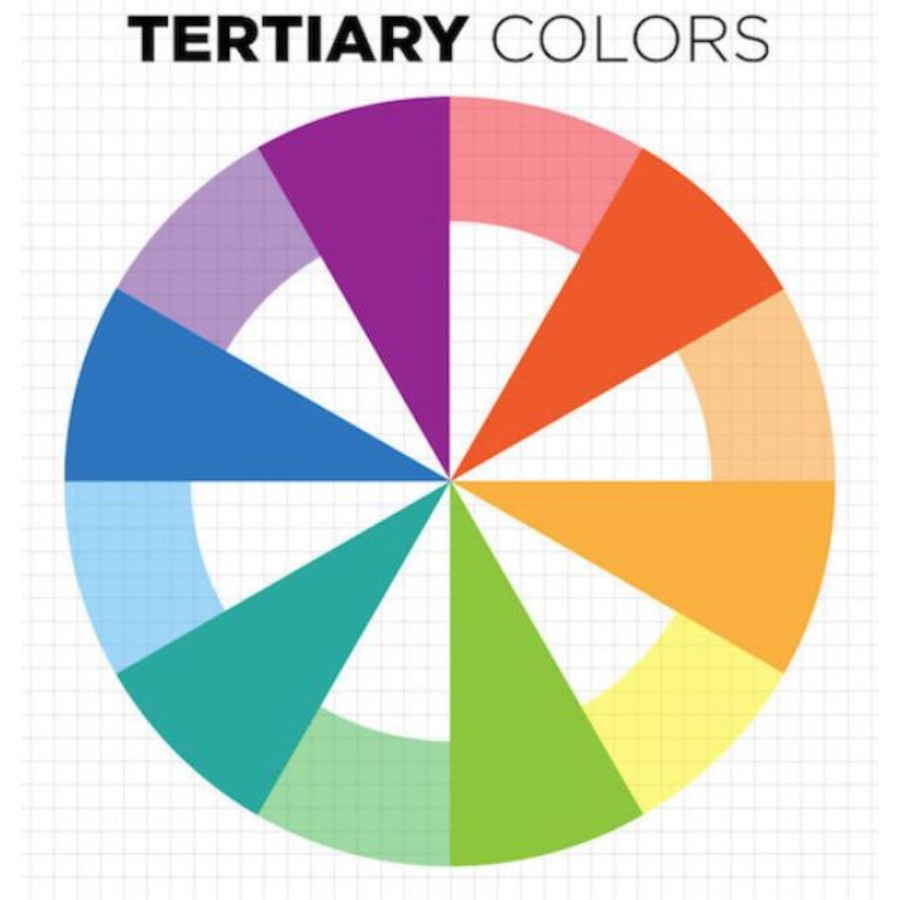
3.3 Tertiary color
Tertiary colors are created by mixing a primary color with a secondary color. For example, if you mix yellow with green, you get cyan. Or mixing red with purple will create magenta or plum.
They can create harmony without taking away from the prominence of other colors. Therefore, understanding and applying tertiary colors is very important in the process of creating art and design.
4. Basic color matching principles of the color wheel
When working with the color wheel, basic color matching principles will help you create harmony and balance in any composition. Understanding these principles will help you feel more confident in choosing colors to serve your specific needs.
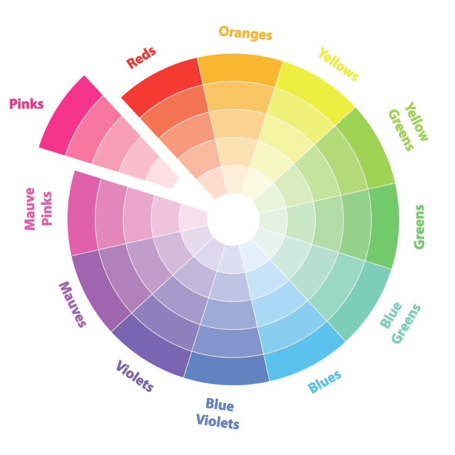
4.1 Monochromatic color scheme
Monochromatic color scheme is a method of using a single color but in different shades. You can use blue, but from light to dark tones. This method creates a sense of unity and harmony for the entire design.
The great advantage of a monochromatic color scheme is its simplicity and ease of application. It focuses attention on a particular color, while creating elegance and sophistication. However, if you are not skillful, a monochromatic color scheme can become boring.
4.2 Similar color scheme
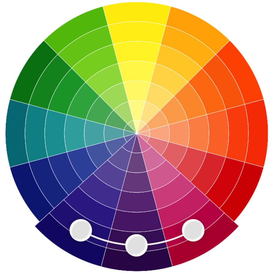
Analogous color schemes use colors that are adjacent to each other. You can combine blue, green, and yellow to create harmony and connection between them.
Analogous color schemes help create uniformity while still maintaining the uniqueness of the design. However, care must be taken to avoid using colors that are too similar and that do not detract from the prominence of each color.
4.3 Contrasting color scheme
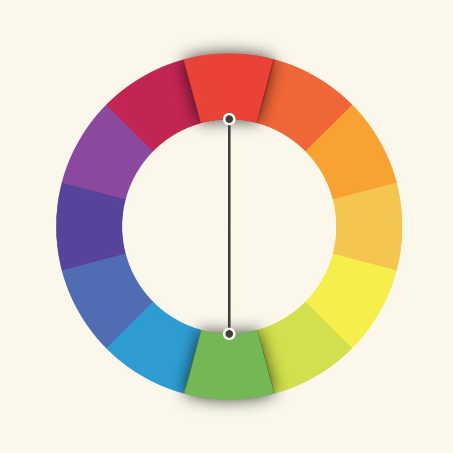
Complementary color schemes are techniques that use colors that are opposite each other. For example, combine red with green or yellow with purple. This technique creates a strong contrast and attracts immediate attention.
Contrasting color schemes are often used in advertising and design to highlight a message or product. They can create a sense of dynamism and power, while also providing excitement to the viewer.
4.4 Complementary color scheme
The complementary color scheme is a complex but effective way to create depth in a design. This method uses a primary color combined with two complementary colors located on either side of the color wheel.
Complementary color schemes not only create interest but also help create a harmonious and sophisticated look. However, care must be taken not to make the design look confusing.
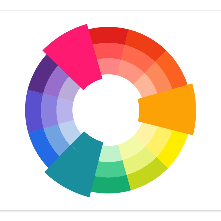
4.5 Triadic complementary color scheme
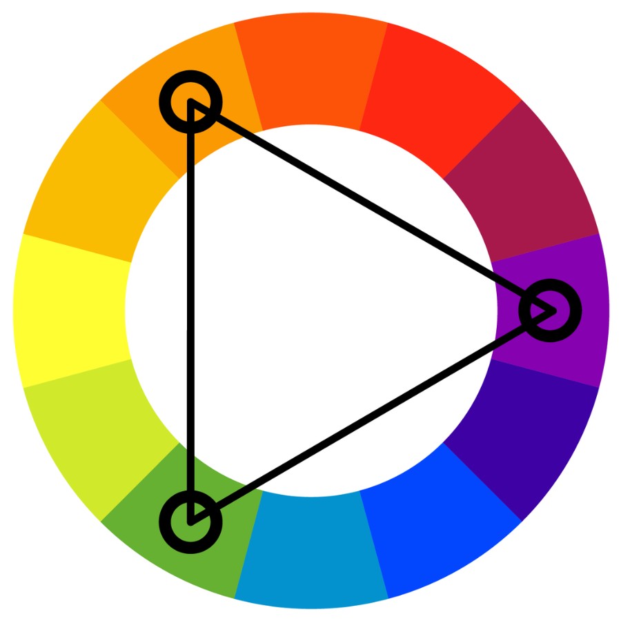
This color scheme involves choosing three colors that are evenly spaced. For example, you would combine red, yellow, and blue together. These tones help create a strong and balanced overall look.
Triadic color schemes not only create balance but also add variety and richness to a design. However, it is important to note that choosing the wrong color can have a negative effect on the overall design.
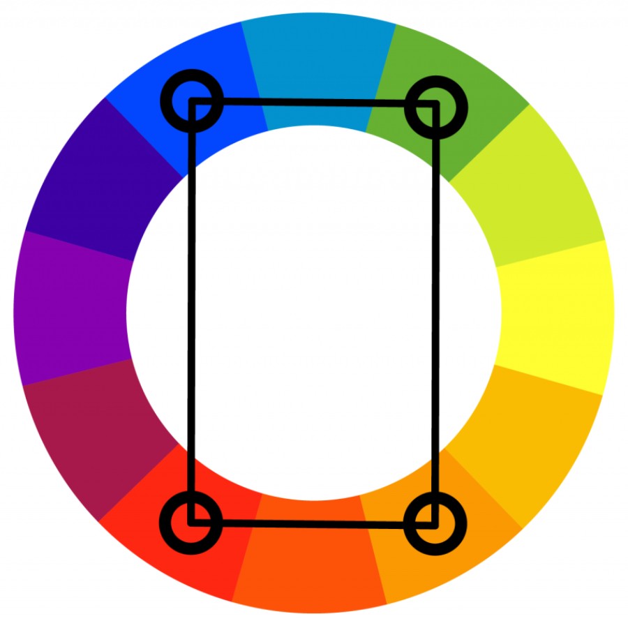
4.6 Tetragonal complementary color scheme
Similar to the triadic color scheme, the tetradic color scheme uses four colors in different positions. This method creates variety and depth in a design, however, using too many colors can make things look cluttered.
Applying these basic color matching principles can help you achieve optimal results. Experiment and explore to find the color combinations that best suit your needs.
5. Some applications of the color wheel in life
The color wheel is not only a useful tool in art, but also has many practical applications in everyday life. Here are some typical areas:
5.1 Color wheel in interior decoration
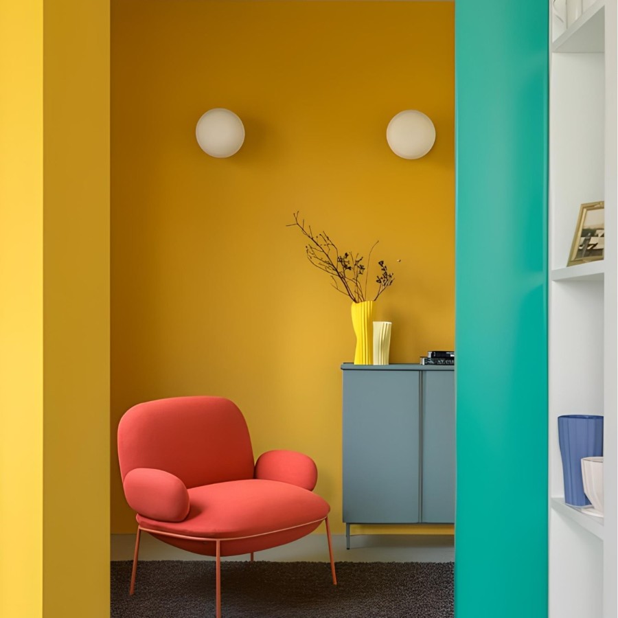
In the field of interior design, the color wheel helps create a harmonious and comfortable living space. The choice of wall paint color, sofa color or other decorative items can all be based on this.
If you want to create a peaceful space, you can use colors in the green and blue range. On the other hand, if you want to create a dynamic and cheerful space, try using bright colors like yellow and orange.
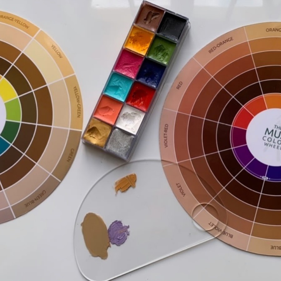
5.2 Color wheel in makeup
In beauty, the color wheel also plays an important role. Makeup artists often use the color wheel to choose lipstick, eye shadow, and other makeup products.
Understanding the principles of color coordination will help makeup artists create a variety of looks. In addition, they also help determine which colors will highlight the client's skin tone, thereby creating the perfect makeup.
5.3 Color wheel in graphics
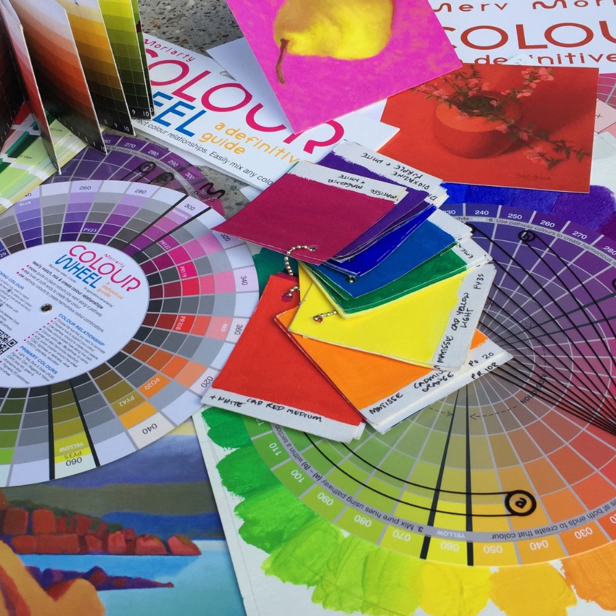
In the graphics industry, designing logos, posters or any communication materials requires proper color coordination.
The designer will rely on this wheel to choose the appropriate colors to create attention and convey messages effectively. Reasonable color coordination will help the product become more attractive and impressive in the hearts of viewers.
5.4 Color wheel in fashion
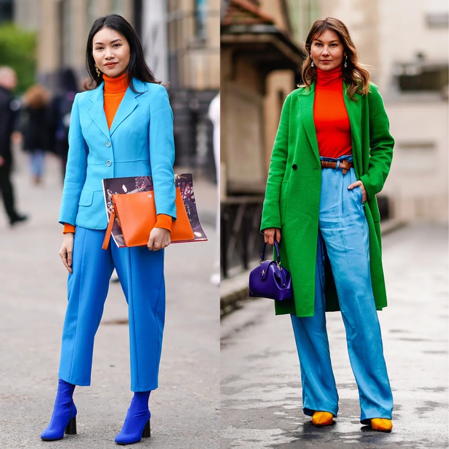
Fashion is an area where color plays a very important role. Fashion designers often use the color wheel to choose colors for their collections.
Color coordination is not only about creating harmony but also expressing each person's personality and style. The right color combination will help you stand out from the crowd and express your unique fashion sense.
5.5 Color wheel in artistic tattooing
In artistic tattooing, the color wheel will help tattoo artists choose the right colors for each tattoo design, thereby creating vivid works of art.
Tattoo artists must consider carefully when creating complex tattoos. The reason is that colors not only affect the beauty of the tattoo but also reflect the personality and emotions of the owner.

6. Important notes when applying the color wheel
First of all, always experiment with different styles. Don’t be afraid to change and look for new combinations, sometimes colors that seem incompatible can create unexpected effects.
Next, pay attention to the lighting in the space you're working in. Lighting can change how colors appear. Test under different lighting conditions before making a decision.
Finally, always put your and your audience’s emotions first. Each color has its own power and evokes different emotions. Consider the purpose and message you want to convey through them.
7. Conclusion
The color wheel is not only a useful tool in art but also an indispensable part in many areas of life. Understanding how to use the color wheel will help you create beautiful and impressive works, at the same time enhancing your creativity.
Related Articles

Nếu bạn đã và đang sở hữu cho mình đôi giày ballet sneaker nhưng vẫn chưa biết outfit nào phù hợp. Xem ngay bài viết này với 5 cách phối đồ với giày ballet sneaker đẹp không có điểm trừ cùng Shondo...

Squid Game 3 chính thức khuấy đảo trên màn ảnh, bạn đã sẵn sàng ngồi liền 6 tập để xem cuộc chiến sinh tồn lần cuối của Gi-Hun chưa? Dưới đây là combo cuối tuần “chuẩn sinh tồn hiện đại” mà Shondo ...

Phong cách Retro là gì mà được nhiều người săn đón như vậy? Cùng Shondo tìm hiểu qua bài viết sau đây để biết thêm nhiều điều thú vị từ điểm đặc trưng cho đến cách phối đồ như thế nào là chuẩn nhé....

Một trong những trào lưu nổi bật gây sốt trên các cộng đồng yêu thời trang chính là phong cách Maillard. Nhưng điều gì khiến chúng lại có sức hút lớn đến như vậy? Shondo sẽ giúp bạn hiểu rõ hơn về...

Áo Polo nữ - item nghe thì tưởng già nhưng thực ra lại đang quay trở lại mạnh mẽ. Từ sân golf đến sân trường, từ văn phòng đến quán cafe, chiếc áo đơn giản với cổ bẻ đặc trưng này bỗng trở nên đa n...
Phối đồ Vintage trong giới thời trang mang đến những nét độc đáo rất riêng. Phong cách này trở thành xu hướng phổ biến không chỉ ở nữ mà còn xuất hiện nhiều ở nam giới. Shondo sẽ cho bạn thấy điều ...

